

Introduction to CSS Grid
An in-depth series on building responsive layouts with Grid.

My expertise lies in building interactive web applications on the client side. Primarily working with technologies like JavaScript, Next.js, TypeScript and Python.
I strongly believe in continuous learning and improving myself, so I try my best to learn in any situation possible, unfavorable or not. Beyond learning, I enjoy writing technical articles and creating projects that both inspire and benefit fellow developers.
As a web developer having a good understanding of CSS grid is very pivotal and will improve your CSS writing skills. Join me as I walk you through the main concepts and how to build layouts with it.
Why this tutorial 🤔
This is a series I'm working on for building responsive websites for developers. I started this project to explain in simple steps how to use Grid to build layouts. Since this is a series, I will be releasing updates to this tutorial as we go on. This series contains the most important concepts of CSS Grid, so you can use this as a reference or guide.
What will you gain from taking this tutorial? 🤓
- A clear understanding of CSS
Grid - Ability to recreate layouts like the chessboard and more with
Grid - Become a grid champion.
Prerequisites ⚙
- A basic knowledge of HTML and CSS
- A text-editor: VS Code, Sublime Text or Atom
- A browser: Firefox, Chrome, Edge or anyone you're most comfortable with, except IE.
Additional Information
You can find the code files for this tutorial here
- This tutorial is much detailed in the topic and very simple to code along with, so take your time and follow through gradually.
The fastest way to become a grid master is to build layouts.
-Unknown Shinobi- 😂
Have the following list down? Let's get started
Table of Content 📚
- What is CSS Grid
- Grid Template Columns
- The Repeat() Notation
- Fixed & Flexible Units
- Combining Units
- Grid Template Rows
- Implicit & Explicit grid
- Track Sizing and Minmax
- Grid Lines
- Grid Highlighter
- Position/Span
- Gutters (Grid Gaps)
- Nested Grid(Sub Grid)
- Grid Alignment
- How to center a div with grid 😅
- Challenges 🐱👤 - Test your knowledge with these simple tasks.
What Is CSS Grid
CSS grid is a layout system used for building two-dimensional layouts by using rows and columns. Grid can be used for building simple and complex layouts. An example of a complex layout is the Periodic Table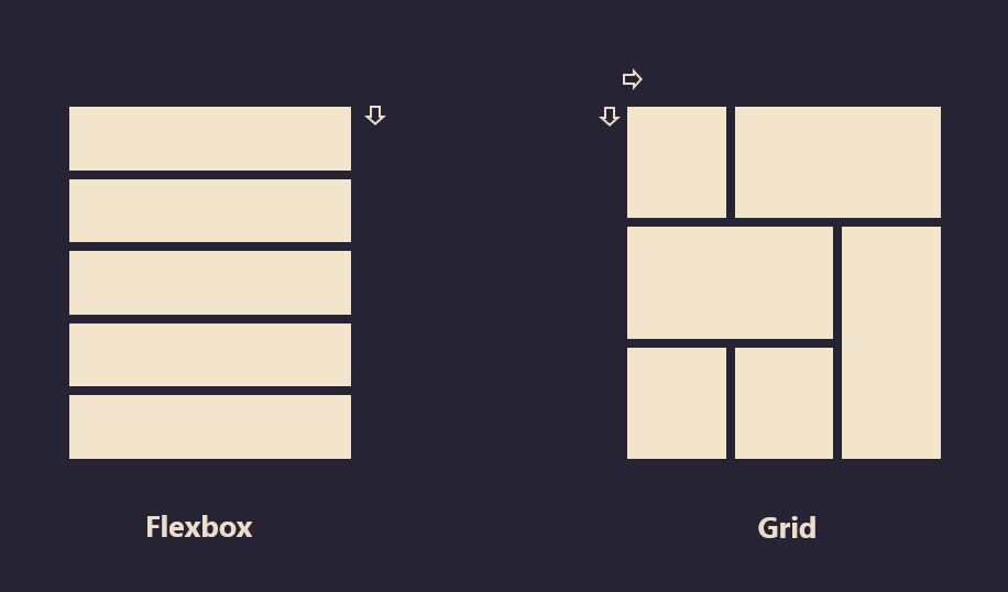
This is how Grid is different from Flexbox by the ability to create multiple layouts with one grid container
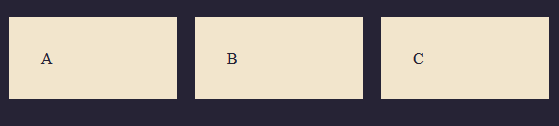
To create a grid, we can simply do this by setting an element to: display: grid or display: inline-grid This automatically makes all the direct children of the element a grid item which is kind of similar to flexbox that has its direct children as flex items.
Example
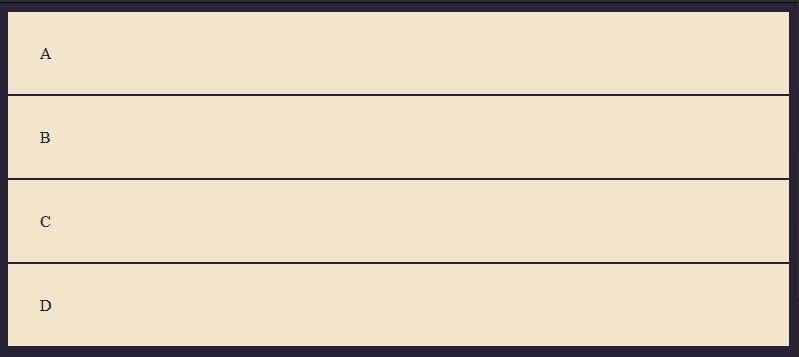
This is a div with a class of container and inside the container, we have four child elements. note: you can call the .container any name you want, common names you'll usually see are .wrapper, .grid, or .grid-container but in this case, we'll be using the .container
<div class="container">
  <div>A</div>
  <div>B</div>
  <div>C</div>
  <div>D</div>
</div>
Now let's add a simple styling to this so we can distinguish them.
body {
   background: #262335;
 }

.container > div {
   color: #262335;
   padding: 2rem;
   border: 1px solid #262335;
   background: #f2e5cc;
 }
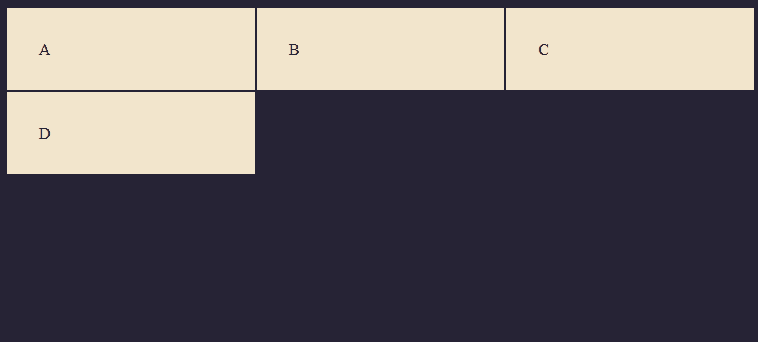
Result
Now let's set the parent .container to a grid container
.container {
  display: grid;
}
Doing this alone doesn't change the markup of the boxes because we haven't specified how we want the layout to be.
To see the grid, we'll have to define the rows and columns respectively, and to do that we use the property: grid-template-columns and grid-template-rows.
Grid Template Columns
So let's specify our markup with these properties
.container {
  display: grid;
  grid-template-columns: 200px 200px 200px;
}
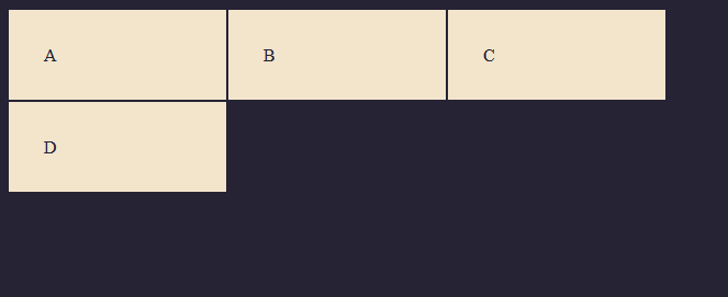
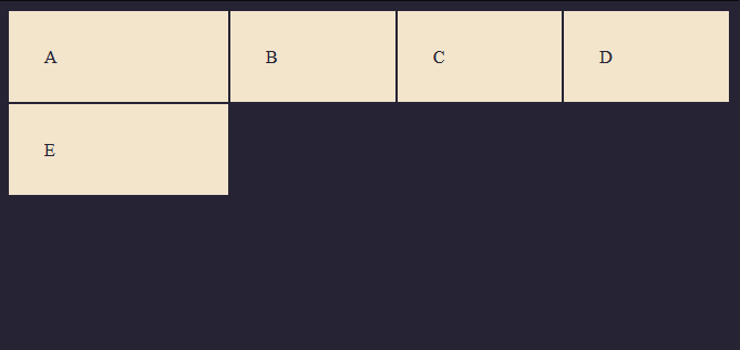
As you can see this creates a grid that is 200px wide each and it spans only to 3 columns and then starts off the other grid items on the next line. That is because we only specified three columns of 200px width each.
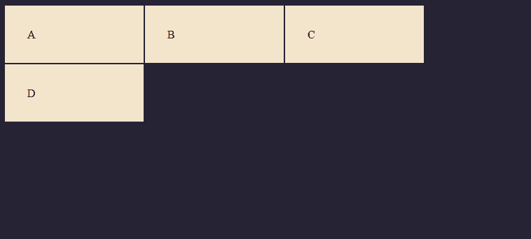
If we add another 200px, this makes it four columns, if we add another div, it'll start on the next line because we said we want only 4 columns. You can keep adding widths to this property to specify how many columns you want. Each value represents a width.
.container {
  display: grid;
  grid-template-columns: 200px 200px 200px 200px;
}

As you can see this created the fourth column because we specified 200px four times. So as more values are added, the columns will increase according to the numbers specified.
The repeat() function
If you find yourself repeating units, you can use the repeat() function to shorten the property.
Earlier we created a grid with four columns using grid-template-columns: 200px 200px 200px 200px, with the repeat function you can write this in a shorter way.
Example
This
.container {
  display: grid;
  grid-template-columns: 200px 200px 200px 200px;
}
Can also be written as:
.container {
  display: grid;
  grid-template-columns: repeat(4, 200px);
}
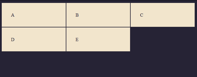
Fixed & Flexible Units
Fixed Unit
Fixed units are absolute units that take the specified width of a given grid cell irrespective of the container width. Examples of fixed units are px, cm, pt, in etc.
Example
<div class="container">
  <div>A</div>
  <div>B</div>
  <div>C</div>
  <div>D</div>
</div>
.container {
  display: grid;
  grid-template-columns: repeat(3, 200px);
}
Result
From the illustration above, we can see that the boxes take up only 200px of the container and it doesn't shrink on smaller widths because the value is fixed and will always remain at 200px no matter the size of the viewport width vw.
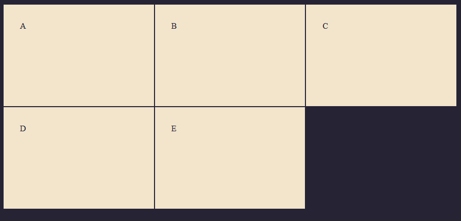
Flexible (or relative) Units
Flexible units are units that adjust to the container element. Examples of flexible units are: rem, vw, vh, %, fr ETC. The fractional unit fr is a new unit of length that represents a fraction of the available space in a grid container. This unit was introduced during the initial stages of CSS grid, which is mostly used when working with Grids. You can also use the repeat property on the fr unit
Example
<div class="container">
  <div>A</div>
  <div>B</div>
  <div>C</div>
  <div>D</div>
</div>
.container {
  display: grid;
  grid-template-columns: repeat(3, 1fr);
}
Result
Combining Units
We can also combine units to get the desired layout.
In the example below, we'll combine a 2fr unit with two 1fr unit tracks. The 2fr unit takes up double of the space and the 1fr track takes up single space each.
Example
<div class="container">
  <div>A</div>
  <div>B</div>
  <div>C</div>
  <div>D</div>
</div>
.container {
  display: grid;
  grid-template-columns: 1fr 2fr 1fr;
}
Result

This can be applied to other units as well. In this example below, we combine a 500px track with a 1fr and 2fr track
<div class="container">
  <div>A</div>
  <div>B</div>
  <div>C</div>
  <div>D</div>
</div>
.container {
  display: grid;
  grid-template-columns: 500px 2fr 1fr;
}

The repeat notation also works with combined units. In the example below, we have a 200px track combined with 3(1fr) tracks.
Example
<div class="container">
  <div>A</div>
  <div>B</div>
  <div>C</div>
  <div>D</div>
  <div>E</div>
</div>
.container {
  display: grid;
  grid-template-columns: 200px repeat(3, 1fr);
}
Result
Grid Template Rows
The grid-template-rows property defines the line names and track sizing functions of the grid rows. This property is used to specify the height of the grid container. Example
<div class="container">
  <div>A</div>
  <div>B</div>
  <div>C</div>
  <div>D</div>
  <div>E</div>
</div>
.container {
  display: grid;
  grid-template-columns: repeat(3, 1fr);
}
As you can see from the example above we have rows automatically added even though we haven't specified the height using the grid-template-rows property, this is what we call the Implicit Grid, more on that later.
Let's add a height of 200px to the columns.
.container {
  display: grid;
  grid-template-columns: repeat(3, 1fr);
  grid-template-rows:  200px 200px;
}
Now we have added a height of 200px to both rows in the grid container. You can also use the repeat() notation on the grid rows as well.
Remember we talked about using fixed units like px for adding absolute values, using 200px on the grid row gives an absolute height on the grid container, which means if we have content that stretches more than 200px in our grid container, it won't stretch the grid row. To illustrate this, let's add 100 words to one of the grid items.
Example
<div class="container">
  <div>Lorem ipsum dolor sit amet, consectetur adipisicing elit. Quaerat voluptatem, sequi, ipsam ipsa facilis numquam officia quisquam quos explicabo ad necessitatibus illum tempora iure sit laboriosam nobis totam architecto modi, doloremque molestias? Commodi recusandae ut dolor, id animi obcaecati eos eaque, quod, tempora quidem quas. Cupiditate, eligendi repellendus quae recusandae corrupti quia velit possimus in ad quaerat porro, a harum et, asperiores consectetur! Recusandae necessitatibus reiciendis eveniet quod alias et modi illum possimus est! Sed nesciunt vero molestias nobis sit ex quidem quisquam eveniet labore atque molestiae eum modi obcaecati, optio officiis nihil, tempore expedita? Perspiciatis repellat incidunt ipsam eaque?<div>
  <div>B</div>
  <div>C</div>
  <div>D</div>
  <div>E</div>
</div>
.container {
  display: grid;
  grid-template-columns: repeat(3, 1fr);
  grid-template-rows: repeat(2, 200px);
}
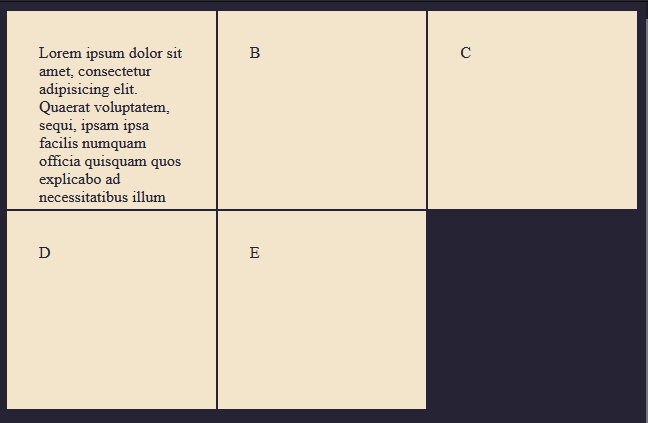
As you can see the height remains at 200px and we can only see enough words to fit into a 200px height. There are quite a few values we can use to fix this.
- Max-content: This sets the size of each row to depend on the largest item in the row.
- Auto: The size of the rows is determined by the size of the container and by the size of the content of the items in the row.
- None: No size is set. Rows are created implicitly.
Example
.container {
  display: grid;
  grid-template-columns: repeat(3, 1fr);
  grid-template-rows: max-content;
}
Now the rows will stretch to fit the content inside the grid container.
Implicit & Explicit grid
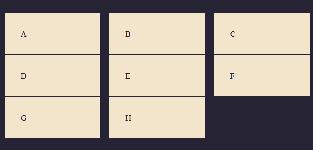
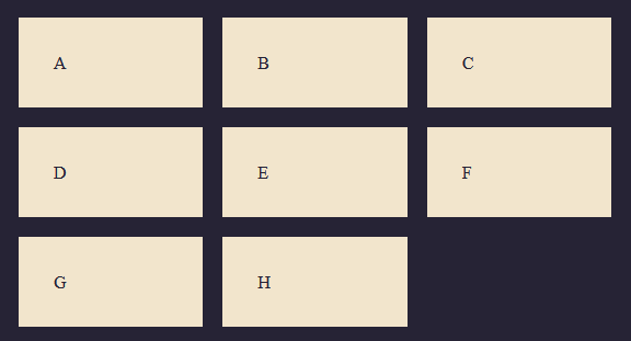
Previously, we specifically defined our column tracks with the grid-template-columns property and the grid also created rows even though we didn't specify the rows with grid-template-rows. These rows are what we call the implicit grid. Whereas the explicit grid consists of any row and column defined with grid-template-columns or grid-template-rows. This might be a little bit confusing at first but with some examples, it'll become easier to grasp.
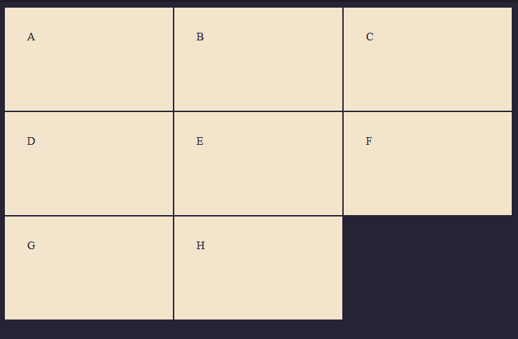
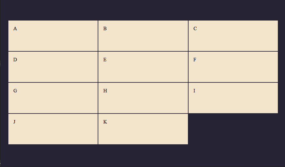
For instance, in the example below, we have 8 grid child elements and we specify three columns and three rows, so the rows outside of the explicit grid not specified are automatically sized by default, where the size is determined by the content inside.
<div class="container">
  <div>A</div>
  <div>B</div>
  <div>C</div>
  <div>D</div>
  <div>E</div>
  <div>F</div>
  <div>G</div>
  <div>H</div>
</div>
.container {
  display: grid;
  grid-template-columns: repeat(3, 1fr);
  grid-template-rows: repeat(2, 150px);
}

In the diagram above, we have two grid tracks (G & H) at the bottom that is outside of the defined grid, since we specified only two rows, the unspecified rows will be automatically sized by default. This is what we call the Implicit grid. The grid tracks above that are defined with 2 rows each is the Explicit grid.
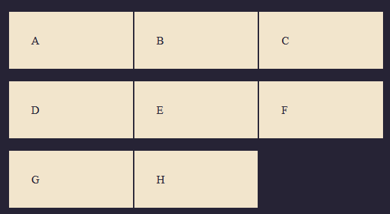
There is a way to control the size of the implicit grid track using: grid-auto-rows and grid-auto-columns
<div class="container">
  <div>A</div>
  <div>B</div>
  <div>C</div>
  <div>D</div>
  <div>E</div>
  <div>F</div>
  <div>G</div>
  <div>H</div>
</div>
.container {
  display: grid;
  grid-template-columns: repeat(3, 1fr);
  grid-auto-rows: 200px;
}
Now, this makes every grid item created in the implicit grid to be 200px tall. This applies to rows that are outside the specified tracks as well.
Track Sizing and Minmax
When defining the sizing for automatically created rows or columns, you may want to give the tracks a minimum size initially and maximum size to ensure the track expands to fit the content. This is where the minmax() property comes in. minmax which stands for minimum - maximum is a function used for specifying the minimum and maximum size of a grid track.
In the example below, we used the minmax() property to specify the initial height of a box to be 150px at minimum and set the maximum to auto which will make the grid container stretch and fit any content if it gets taller than 150px.
Example
Here is an example without the minmax() property
<div class="container">
  <div>A</div>
  <div>B</div>
  <div>
    Lorem ipsum dolor sit amet, consectetur adipisicing elit. Impedit
    exercitationem aliquam architecto necessitatibus dolor fuga similique qui
    autem! Similique ducimus hic autem voluptas rerum, soluta nam ab doloremque
    accusantium ex.
  </div>
  <div>C</div>
  <div>D</div>
</div>
.container {
  display: grid;
  grid-template-columns: repeat(3, 1fr);
  grid-auto-rows: 150px;
}
Result
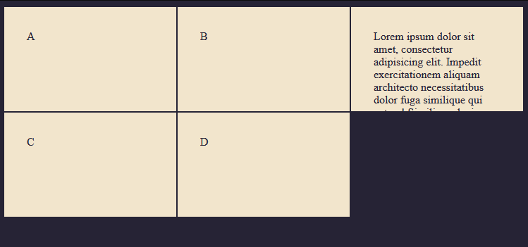
As you can see from the image above, the content of the third box stretches out of its container because we gave it a fixed width of 150px.
Here is the same example with the minmax() property
.container {
  display: grid;
  grid-template-columns: repeat(3, 1fr);
  grid-auto-rows: minmax(150px, auto);
}
Result
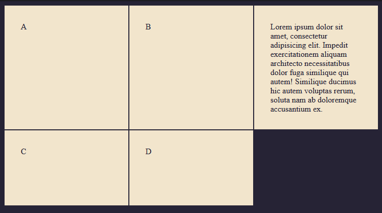
As you can see from the diagram, we explicitly set the box to have a minimum height of 150px initially, but the one that has content inside stretches out more than 150px in other to fit the content of the grid.
This is being controlled by the auto attribute. Notice that box 4 and 5 remain at 100px height because the content is small enough to fit into the container without stretching the grid track.
Grid Lines
When we define a grid container, lines are automatically drawn both horizontally and vertically along the grid tracks. (Though you can't see these lines so you'll have to use a tool called the grid highlighter). These lines are used to position items within a grid track.
For example
Below is a grid container with 3 columns and 2 rows but has 4 grid lines on the column and 3 grid lines on the row.
Example
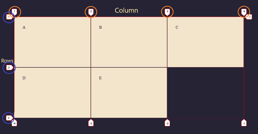
Grid lines are those lines in between the columns and rows. As shown on the diagram above, the column lines are the numbers inside the orange circle from 1 - 4, while the row lines are the ones inside the blue circle from 1 - 3.
Grid lines are very helpful when positioning/spanning elements. They can also be named, you can read more about naming grid lines here.
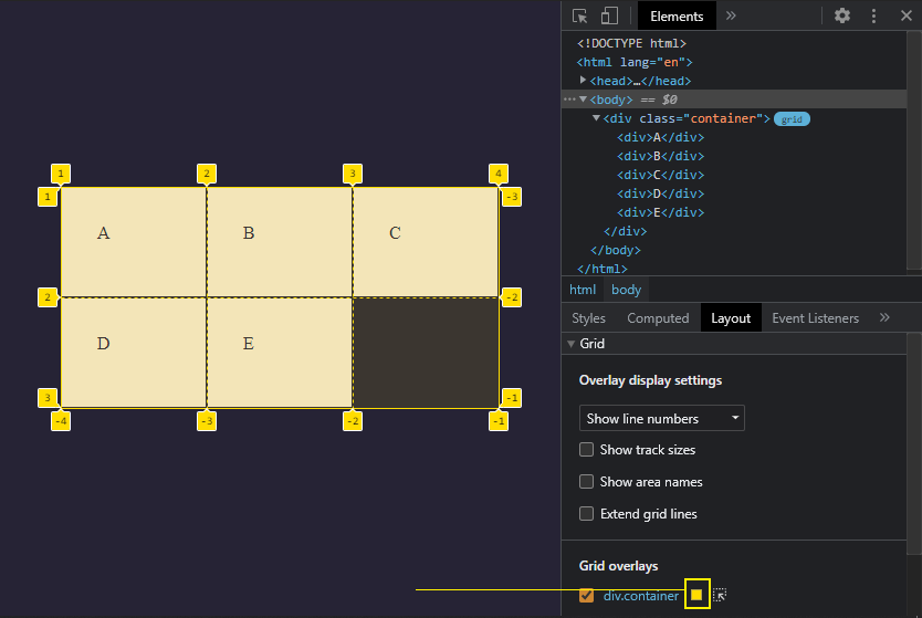
Grid Highlighter
The Grid Inspector allows you to examine CSS Grid Layouts using the DevTools, discovering grids present on a page, examining and modifying them, debugging layout issues, and more. This is the tool we can use to view our grid lines.
Firefox
Open up the developer's tab using Ctrl + Shift + I on windows or CMD + Opt + I on mac.
- Navigate to the layout section, you'll see the
Gridmenu just above the box model. - Check the grid-container box to enable the grid highlighter.
Or
- Check the tiny grid box next to the
display: gridin the developer tool.
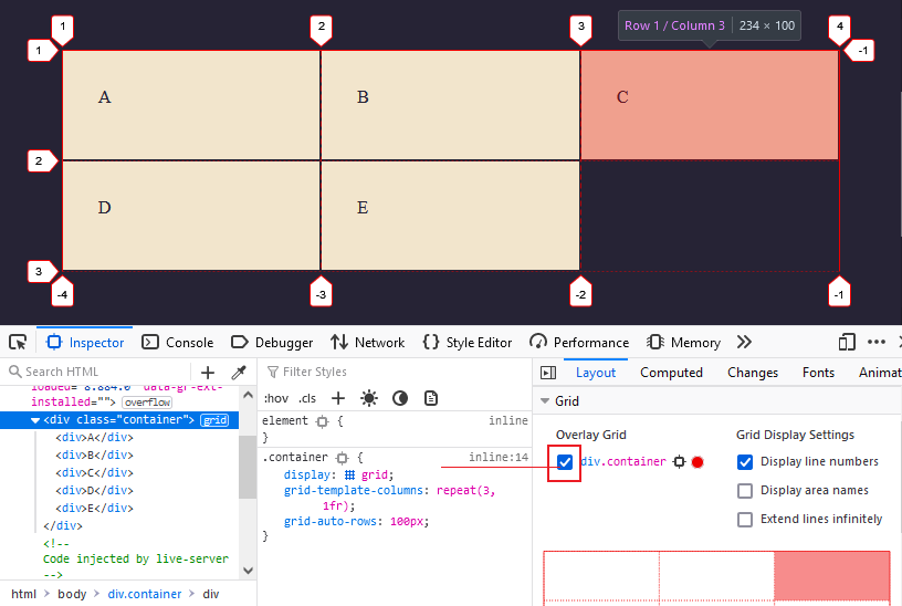
Chrome
If you're on Chrome, open up the developer tools and navigate to the Layout tab as well, you'll see the grid overlay button which will toggle on the grid highlighter.
As you can see, this displays a colored border around the grid container and between each grid item and numbers going horizontally and vertically, these numbers are the ones we saw when we talked about Grid Lines earlier on.
Position/Span Grid Rows and Columns
We can span or position grid columns and rows along the lines of the grid container. Spanning grid columns and rows can be very useful when building complex layouts. Spanning grid items consist of the following property: grid-column-start, grid-column-end and grid-row-start, grid-row-end properties.
This is where the grid line and the highlighter tool come in handy because we'll be using these lines to position items within a given grid track. I'll be sharing an in-depth guide in another article (hopefully) to cover more details about grid spanning and positioning, for now, let's cover the basics.
 Source: Frontendmentor
This is an example of a layout built using the position property. Just to give you an example.
Here is another example and one you might be familiar with. The windows 10 start menu.
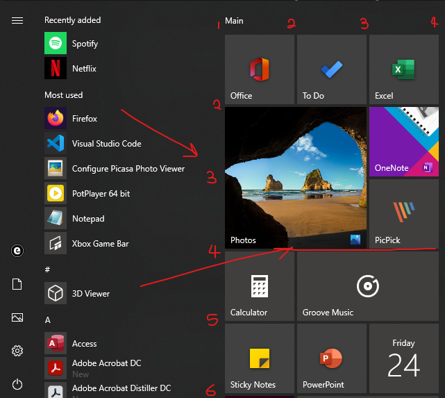
As you can see from the image above, I numbered the columns and rows. Now if you look at the photos app, you'll notice it starts from the first column (Line 1) to the second column (Line 3) and it spans from the second row (Line 2) to the third row (Line 4).
Grid Column Start/End
To position a grid child element, we'll do that by first targeting it using sudo selectors (though you can add custom classes to the items and target it with that if you like) and then we use the properties: grid-column-start, grid-column-end and grid-row-start, grid-row-end
<div class="container">
  <div>A</div>
  <div>B</div>
  <div>C</div>
  <div>D</div>
  <div>E</div>
  <div>F</div>
  <div>G</div>
  <div>H</div>
</div>
.container {
  display: grid;
  grid-template-columns: repeat(3, 1fr);
}
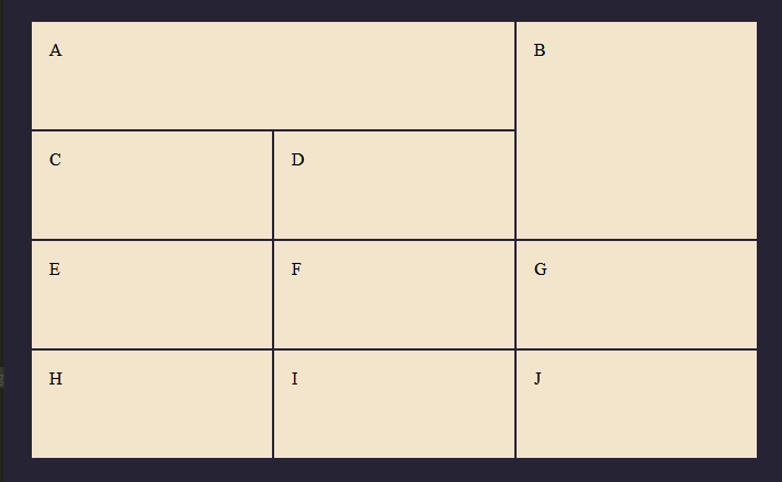
Now let's target the first child and position it on the second line.
.container div:first-child {
  grid-column-start: 2;
}
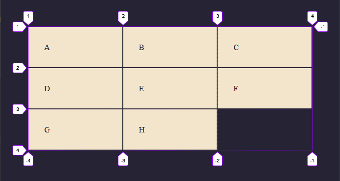
By specifying grid-column-start: 2; the selected child will start its column on the second line.
From the image, we can see that Item one is now positioned at line 2 and the other items are pushed over which fills or creates empty spaces on the grid. In this case, the empty space we had earlier is now filled after the selected item was spanned to the second column.
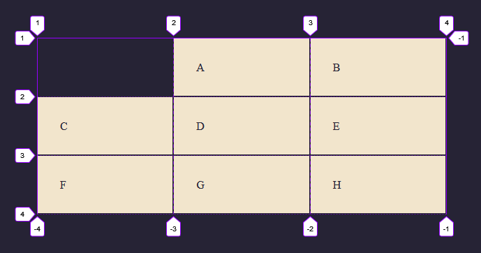
So we can specify the start position with grid-column-start, we can also specify where the grid item ends using the grid-column-end property.
.container div:first-child {
  grid-column-start: 2;
  grid-column-end: 4;
}
Now you can see the selected child (Item one) starts at line 2 on the column, spans across, and ends in line 4. We can also span the rows down using the grid-row-start and grid-row-end property.
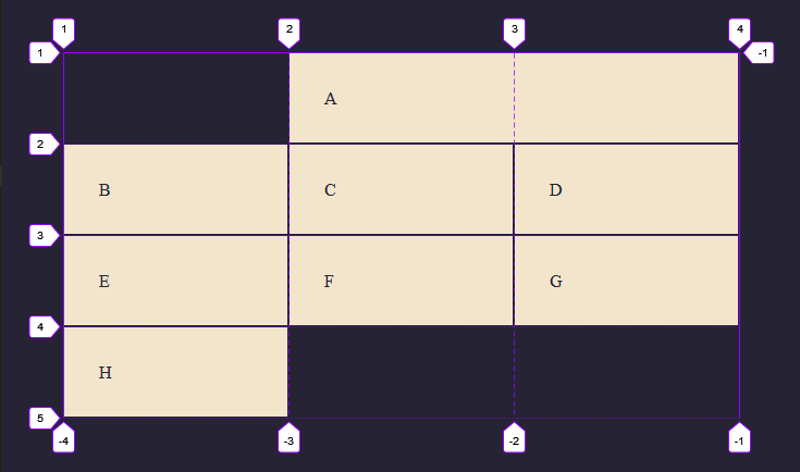
Grid Row Start/End
.container div:first-child {
  grid-column-start: 2;
  grid-column-end: 4;
  grid-row-start: 1;
  grid-row-end: 4;
}
Now the selected child starts at Line 1 on the rows and ends in line 4 while maintaining the position we specified on the columns earlier.
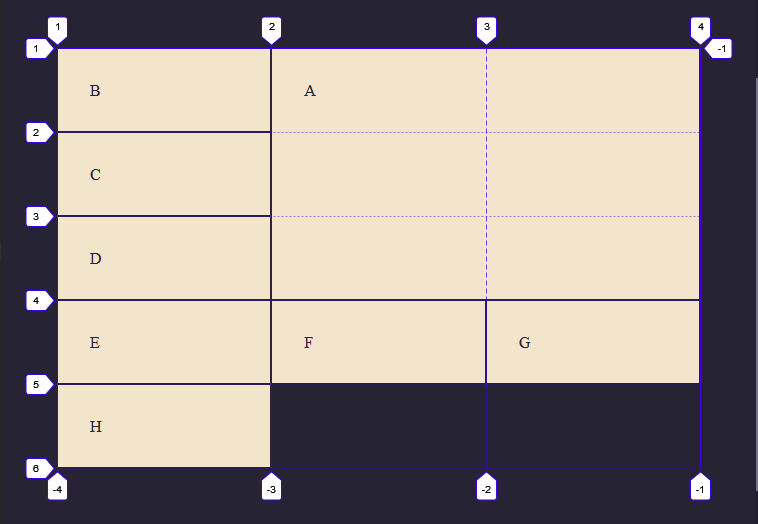
Of course, there is a shorter way (just like every other property in CSS) of positioning grid items by using the property: grid-column and grid-row which is a combination of grid-column start/grid-column-end & grid-row-start/grid-row-end
.container div:first-child {
  grid-column: 2 / 4;
  grid-row: 1 / 4;
}
This gives us the same result as above and is much shorter to write. Note: The first number represents the start and the second number the end of the values.
Span
This
.container div:first-child {
  grid-column: 1 / 4;
  grid-row: 1 / 4;
}
Can also be written like this.
.container div:first-child {
  grid-column: 1 / span 3;
  grid-row: 1 / span 3;
}
The span property is saying start at 1 and span across 3, which gives us the same result. One of the differences of using span is that you don't need to know what line number you want the grid cell to move to, you can just say use the span to specify how many lines you want the grid item to move across and the grid item would span across as instructed. This might be a bit tricky to grasp at first and you don't have to use the span if you don't want to but I think it is something you might need to know.
Gutters (Grid Gaps)
Gutters also known as gaps can be added between grid rows or columns to space them apart. This behaves almost like adding margins in between the grid items but this time we're adding the gap property to the grid container and not the individual grid items. To do that, we use the grid-column-gap and grid-row-gap property which is short for row-gap (Adds spacing between rows), column-gap (Adds spacing between columns), and gap (Adds spacing between columns and rows).
Example 1
<div class="container">
  <div>A</div>
  <div>B</div>
  <div>C</div>
  <div>D</div>
  <div>E</div>
  <div>F</div>
  <div>G</div>
  <div>H</div>
</div>
.container {
  display: grid;
  grid-template-columns: repeat(3, 1fr);
  column-gap: 1rem;
}
This adds a spacing of 1rem between every column in the grid container as seen in the image above.
Example 2
.container {
  display: grid;
  grid-template-columns: repeat(3, 1fr);
  row-gap: 1rem;
}
This adds a spacing of 1rem between every row in the grid container as seen in the image above.
To add a gap between columns and rows we use the gap property, which is a combination of column-gap and row-gap.
Now you can see this adds spacing of 1rem between the columns and the rows.
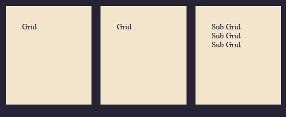
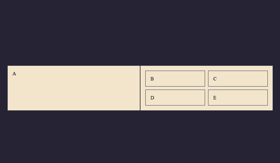
Nested Grid(Sub Grid)
A grid item can become a grid container. To do this, we have to set this grid item to display as a grid, which makes it a sub-grid of the main grid(kinda like saying a grid within a grid).
Example
<div class="container">
  <div>Grid</div>
  <div>Grid</div>
  <div clas="nested">
    <div>Sub Grid</div>
    <div>Sub Grid</div>
    <div>Sub Grid</div>
  </div>
</div>
.container {
  display: grid;
  grid-template-columns: repeat(3, 1fr);
  grid-auto-rows: 200px;
  grid-gap: 1rem;
}
In the following example, I have a three-column grid that covers the whole width of the container. On the third grid item, there are some sub-items.
But let's style the nested grid items so we can clearly see what is going.
.nested div {
  border: 1px solid #262335;
  padding: 0.5rem;
}
Now we set the nested container to a grid which makes all the items within it, grid items.
.nested {
  display: grid;
  grid-template-columns: repeat(3, 1fr);
}
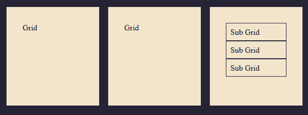
This is how you nest a grid. For these nested grid items, we can also change the width, add a height or grid-gap, Etc.
.nested {
  display: grid;
  grid-template-columns: repeat(3, 1fr);
  grid-gap: 1rem;
}
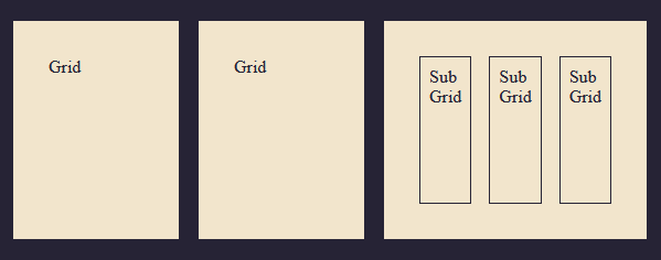
It works the same way as a regular grid item.
Grid Alignment
When it comes to aligning items, Grid and Flexbox share a lot of similarities, but you might notice a few differences since Grid is two-dimensional and Flexbox one.
Grid items can be aligned on the X and Y axis in its container using the properties:
align-itemsalign-selfjustify-itemsjustify-self
Alignment on the X-axis
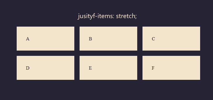
We can align-items on the X-axis which is also known as the inline axis(horizontal axis) using the justify-items and justify-self properties. which are positioned using the following values:
autonormalstartendcenterstretchbaselinefirst baselinelast baseline
For example, we have 3 columns within our grid, we can align these grid items using any of the properties above.
<div class="container">
  <div>A</div>
  <div>B</div>
  <div>C</div>
  <div>D</div>
  <div>E</div>
  <div>F</div>
</div>
.container {
display: grid;
grid-template-columns: repeat(3, 1fr);
grid-gap: 1rem;
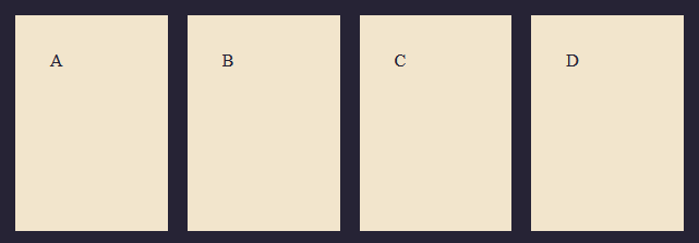
justify-items: start;
justify-items: end;
justify-items: center;
justify-items: stretch;
}
Here is an illustration of the listed properties and how they appear in the container.
Justify-items: start We can see the grid items were aligned on the X-axis to the start (which is the left)
Justify-items: end With this property, the grid items moved to the opposite direction, which is the end of the column.
You should get the idea now, the center value will center the grid items and the stretch, which is the default value will stretch out the items.
We looked at the most commonly used four, but you can choose to explore other values.
Alignment on the Y-axis
In other to align elements on the Y axis, the grid container has to have a specified height added to the grid container. Because we're aligning on the block axis(vertical axis) by using the align-items and align-self properties. which are positioned using the same values.
<div class="container">
  <div>A</div>
  <div>B</div>
  <div>C</div>
  <div>D</div>
  <div>E</div>
  <div>F</div>
</div>
.container {
display: grid;
grid-template-columns: repeat(3, 1fr);
grid-auto-rows: 150px;
grid-gap: 1rem;
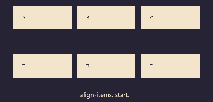
align-items: center;
align-items: end;
align-items: start;
align-items: stretch;
}
You can see we are using the same example as we used in justify-items above. This time we are applying the align-items property.
Here is an illustration of the listed properties and how they appear in the container.
Align-Self / Justify-self
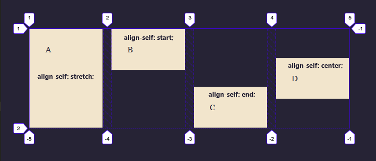
Now instead of aligning all the items in a grid container, you can align them individually using the align-self and justify-self property. To do this, let's add classes to each grid item so we can target them.
<div class="container">
  <div class="box1">A</div>
  <div class="box2">B</div>
  <div class="box3">C</div>
  <div class="box4">D</div>
</div>
.container {
  display: grid;
  grid-template-columns: repeat(4, 1fr);
  grid-auto-rows: 200px;
  grid-gap: 1rem;
}
To demonstrate the different alignment values, each box will be assigned a single property.
The first box will be assigned align-self: stretch which is the default behavior of this property. The second box, align-self: start, the third end, and the fourth center.
.box1 {
  align-self: stretch;
}

.box2 {
  align-self: start;
}

.box3 {
  align-self: end;
}

.box4 {
  align-self: center;
}
As with align-self and align-items, you can apply justify-items to the grid container, to set the justify-self value for all items.
.box1 {
  justify-self: stretch;
}

.box2 {
  justify-self: start;
}

.box3 {
  justify-self: end;
}

.box4 {
  justify-self: center;
}
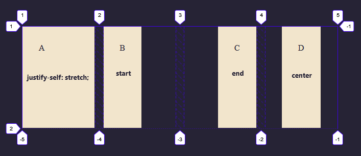
The justify-self and justify-items properties are not implemented in flexbox. This is due to the one-dimensional nature of flexbox, and that there may be multiple items along the axis, making it impossible to justify a single item.
How to center a div with grid
By combining the align and justify property, we can easily center an item inside a grid area.
<div class="container">
  <div></div>
</div>
.box {
  background: #f2e5cc;
  width: 100px;
  height: 100px;
  align-self: center;
  justify-self: center;
}

.container {
  display: grid;
  grid-template-columns: 1fr;
  height: 100vh;
}
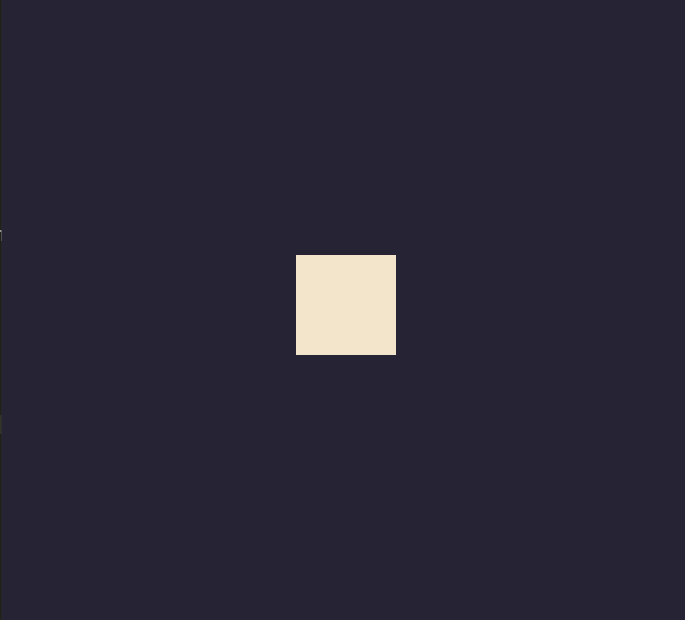
This is just a simple way to center a div using CSS grid. Other ways involve using grid areas which we'll discuss in another tutorial.
So this brings us to the end of this tutorial. Congratulations if you made it this far. Now comes the fun part.
I curated a few simple yet interesting challenges you can take to test your layout-building abilities. Why? because it won't be no good if we don't put what we've learned into practice and it's a great way to have what you have learned stick. I strongly recommend you take these challenges to test yourself.
Challenges
There are 4 challenges in total which consist of 2 very simple ones and 2 brain-teasing ones.
Your Task
You are required to do these challenges by yourself using the CSS tutorial to refresh your memory. The code files can be gotten from this link so feel free to take a look at how I completed each challenge if you're having too much difficulty. I strongly recommend you have a go at it first and see if you can solve them by yourself.
Challenge 1
Hints
- Create a 3 column Grid with 4 rows.
- The grid items must have the same width and the height should be 100px long.
Challenge 2
Hints
- Build a 2 column grid with 4 subgrid items inside the second grid item.
- Each subgrid item should have a gap of 10px.
Challenge 3
Hints
- The rows are explicitly stated to be 100px.
- On the column, position box A to start at line 1 and end on line 3.
- On the column, position box B at line 3
- On the row, position box B to start at line 1 and end on line 3.
Challenge 4
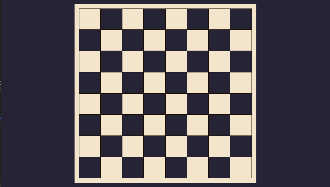
Hints
- This is an 8 x 8 chess layout which means there are 64 grid items.
Once again, you can find the solution to the code challenges here.
Final Words
This tutorial is a combination of what I learned combining MDN docs and Brad Traversy's tutorial on CSS Grid. Just to iterate, I made this as a reference or guide for CSS Grid so you can bookmark this tutorial for easy reference.
Resources
If you are into video courses or tutorials as I am, here are a few recommended videos for that.
CSS Grid Layout Crash Course by Brad Traversy.
Build a Responsive Grid CSS Website Layout From Scratch by Brad Traversy.
If you're looking for a lot more structure, you can also check out his Udemy course on HTML and CSS. Modern HTML and CSS From The Beginning (Including SASS) by Brad Traversy
If you have any questions, found any errors, or just want to contribute to this project to make it better, feel free to check out the project repo on GitHub. You can star, like, and share it if you found it helpful and I'll see you in another article. Bye.. 👋🏾


