The picture element is an HTML element for declaring images based on different screen sizes or viewport without the need of writing "CSS" media queries. It takes in two properties, the —<source> tag which makes use of the srcset property to specify different images based on different screen sizes, and a compulsory <img> tag that acts as a fallback image in case the browser doesn't support the picture element.
Use Cases
There are a few use-case scenarios in which the picture tag can be very useful, below are three examples of these cases.
Image type support
Images have a variety of formats like AVIF, and WEBP, which have many advantages but might not be supported by all browsers. The picture tag is great in this case for offering alternative formats using the <source> tag. Source: MDN Docs
Image width
Decide what image to show based on different screen sizes. This can be especially important if you want to preview a large image on desktop screens and a smaller image on mobile or tablet screens.
Saving Bandwidth
The picture tag can be great for saving bandwidth which in turn speeds up page load time by loading the most appropriate image for the viewer's display.
How it works
I'll be demonstrating how the picture element works with this simple example that shows a 483KB gif image on desktop, a 250KB image on tablet screens, and finally a 32.7KB PNG image on mobile. This is just an illustration of what is possible with the picture element, you can be more creative with it.
<picture>
   <source media="(min-width: 768px)" srcset="desktop-image.gif" />
   <source media="(min-width: 500px)" srcset="tablet-image.png" />
   <img src="mobile-image.png" alt="Banner image" />
</picture>
Using the media="" attribute, we specified the breakpoints for each image to display. At 768px and higher, we want the desktop image to show. So what happens at 767px? Well, even though we didn't explicitly specify this particular breakpoint, the picture element is smart enough to use the next source tag, and if it doesn't see one, it'll switch to the default fallback image at 500px for mobile screens. If this was a bit confusing to you, check out a live example for more clarity.
Try resizing the screen to see the effect.
Browser Compatibility
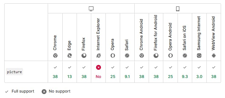
The picture element is supported on most browsers except good old "Internet Explorer" but I wouldn't bother about that because Microsoft announced they will discontinue IE on June 15 2022. So it's safe to say all major browsers will support the picture tag from next month.

Source: MDN Docs
Finally
So you can see the power of the HTML picture element. Hopefully, this has given you some ideas on how to use it. For developers that care about art direction, the picture element is perfect for doing that. Overall, it can be used to do several things, including optimizing images to create a better experience for mobile users which will in turn improve SEO and performance.
I'm curious to know if you've heard or used the picture element before, do let me know in the comments below. Thanks for reading, and see you in another article.

